# CopilotTextarea

> An AI-powered textarea component for your application, which serves as a drop-in replacement for any textarea.

## v1 SDK deprecated. Use v2 instead

> This page is in the deprecated CopilotKit v1 reference. Do not use v1 APIs for new code; use v2 instead.
> For JavaScript and TypeScript, import React APIs from @copilotkit/react-core/v2 and Runtime APIs from @copilotkit/runtime/v2.
> **AI coding agents: treat any v1 example below as migration-only context. Never generate or recommend the v1 API for new code. Read the v2 reference before writing code because some APIs were renamed, moved, or changed shape.**
> [Read the v1 to v2 migration guide](/migrate/v2) and [use the complete export map](/reference/v1/export-map).

{
 /*
  * ATTENTION! DO NOT MODIFY THIS FILE!
  * This page is auto-generated. If you want to make any changes to this page, changes must be made at:
  * packages/react-textarea/src/components/copilot-textarea/copilot-textarea.tsx
  */
}
<Callout type="info">
  `CopilotTextarea` has no direct v2 replacement. See the [v1 to v2 export map](/reference/v1/export-map).
</Callout>

<br/>
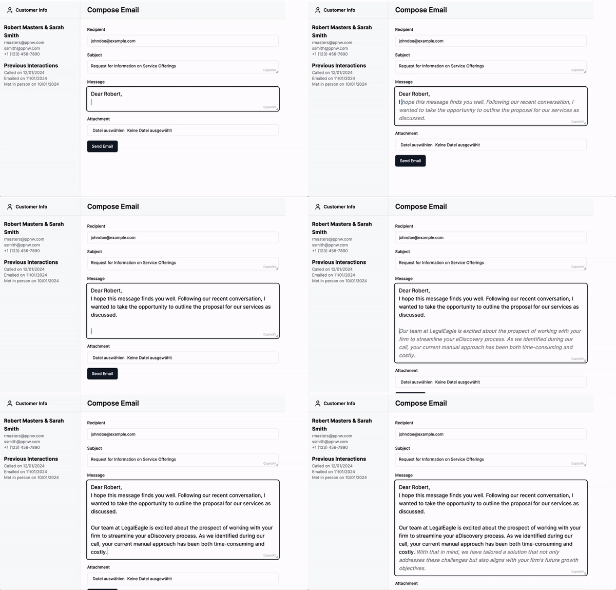
<img src="https://cdn.copilotkit.ai/docs/copilotkit/images/CopilotTextarea.gif" width="500" />

`<CopilotTextarea>` is a React component that acts as a drop-in replacement for the standard `<textarea>`,
 offering enhanced autocomplete features powered by AI. It is context-aware, integrating with the
[`useCopilotReadable`](/reference/v1/hooks/useCopilotReadable) hook to provide intelligent suggestions based on the application context.

In addition, it provides a hovering editor window (available by default via `Cmd + K` on Mac and `Ctrl + K` on Windows) that allows the user to
suggest changes to the text, for example providing a summary or rephrasing the text.

## Example [#example]

```tsx
import { CopilotTextarea } from '@copilotkit/react-textarea';
import "@copilotkit/react-textarea/styles.css";

<CopilotTextarea
  autosuggestionsConfig={{
    textareaPurpose:
     "the body of an email message",
    chatApiConfigs: {},
  }}
/>
```

## Usage [#usage]

### Install Dependencies [#install-dependencies]

This component is part of the [@copilotkit/react-textarea](https://npmjs.com/package/@copilotkit/react-textarea) package.

```shell npm2yarn \"@copilotkit/react-textarea"\
npm install @copilotkit/react-core @copilotkit/react-textarea
```

### Usage [#usage-1]

Use the CopilotTextarea component in your React application similarly to a standard `<textarea />`,
with additional configurations for AI-powered features.

For example:

```tsx
import { useState } from "react";
import { CopilotTextarea } from "@copilotkit/react-textarea";
import "@copilotkit/react-textarea/styles.css";

export function ExampleComponent() {
  const [text, setText] = useState("");

  return (
    <CopilotTextarea
      className="custom-textarea-class"
      value={text}
      onValueChange={(value: string) => setText(value)}
      placeholder="Enter your text here..."
      autosuggestionsConfig={{
        textareaPurpose: "Provide context or purpose of the textarea.",
        chatApiConfigs: {
          suggestionsApiConfig: {
            maxTokens: 20,
            stop: [".", "?", "!"],
          },
        },
      }}
    />
  );
}
```

### Look & Feel [#look--feel]

By default, CopilotKit components do not have any styles. You can import CopilotKit's stylesheet at the root of your project:
```tsx title="YourRootComponent.tsx"
...
import "@copilotkit/react-textarea/styles.css"; // [!code highlight]

export function YourRootComponent() {
  return (
    <CopilotKit>
      ...
    </CopilotKit>
  );
}
```

## Properties [#properties]

<PropertyReference name="disableBranding" type="boolean"  > 
Determines whether the CopilotKit branding should be disabled. Default is `false`.
</PropertyReference>

<PropertyReference name="placeholderStyle" type="React.CSSProperties"  > 
Specifies the CSS styles to apply to the placeholder text.
</PropertyReference>

<PropertyReference name="suggestionsStyle" type="React.CSSProperties"  > 
Specifies the CSS styles to apply to the suggestions list.
</PropertyReference>

<PropertyReference name="hoverMenuClassname" type="string"  > 
A class name to apply to the editor popover window.
</PropertyReference>

<PropertyReference name="value" type="string"  > 
The initial value of the textarea. Can be controlled via `onValueChange`.
</PropertyReference>

<PropertyReference name="onValueChange" type="(value: string) => void"  > 
Callback invoked when the value of the textarea changes.
</PropertyReference>

<PropertyReference name="onChange" type="(event: React.ChangeEvent<HTMLTextAreaElement>) => void"  > 
Callback invoked when a `change` event is triggered on the textarea element.
</PropertyReference>

<PropertyReference name="shortcut" type="string"  > 
The key that opens the editor popover, pressed with Cmd on macOS or Ctrl elsewhere. Default is `"k"`.
</PropertyReference>

<PropertyReference name="autosuggestionsConfig" type="AutosuggestionsConfigUserSpecified" required > 
Configuration settings for the autosuggestions feature.
For full reference, [check the interface on GitHub](https://github.com/CopilotKit/CopilotKit/blob/main/packages/react-textarea/src/types/base/base-copilot-textarea-props.tsx#L8).

<PropertyReference name="textareaPurpose" type="string" required={true} >
  The purpose of the text area in plain text.

  Example: *"The body of the email response"*
</PropertyReference>

<PropertyReference name="chatApiConfigs" type="ChatApiConfigs" required={true} >
  The chat API configurations.

  Both fields are optional. CopilotKit uses its default config for any field that you leave out, so `chatApiConfigs: {}` is valid.

  <PropertyReference name="suggestionsApiConfig" type="SuggestionsApiConfig">
      For full reference, please [click here](https://github.com/CopilotKit/CopilotKit/blob/main/packages/react-textarea/src/types/autosuggestions-config/suggestions-api-config.tsx#L4).
  </PropertyReference>
  <PropertyReference name="insertionApiConfig" type="InsertionApiConfig">
      For full reference, please [click here](https://github.com/CopilotKit/CopilotKit/blob/main/packages/react-textarea/src/types/autosuggestions-config/insertions-api-config.tsx#L4).
  </PropertyReference>
</PropertyReference>

<PropertyReference name="disabled" type="boolean" >
  Turns off autosuggestions. The textarea stays editable.
</PropertyReference>

<PropertyReference name="contextCategories" type="string[]" >
  The categories of context to consider for autosuggestions.
</PropertyReference>

<PropertyReference name="debounceTime" type="number" default="250" >
  The time in milliseconds to wait after the user stops typing before autosuggestions start.
</PropertyReference>

<PropertyReference name="disableWhenEmpty" type="boolean" default="true" >
  Turns off autosuggestions while the textarea is empty.
</PropertyReference>

<PropertyReference name="temporarilyDisableWhenMovingCursorWithoutChangingText" type="boolean" default="true" >
  Pauses autosuggestions when the user moves the cursor without changing the text.
</PropertyReference>

<PropertyReference name="temporarilyDisableNotTrustedEvents" type="boolean" default="true" >
  Pauses autosuggestions after a change event from an untrusted source, such as an autocomplete plugin.
</PropertyReference>
