MCP
Integrate Model Context Protocol (MCP) servers into your React applications
Introduction
Your agent needs tools and data that live in an MCP server, such as a docs search or a ticket system. Add the server to your agent, and the agent can call its tools from the chat.
For the protocol itself, see the Model Context Protocol website. To decide whether your server needs its own UI, see When you do (and don't) need an MCP App below.
Looking for MCP Apps?
If you want MCP servers to return interactive UI components that render directly in the chat, check out MCP Apps.
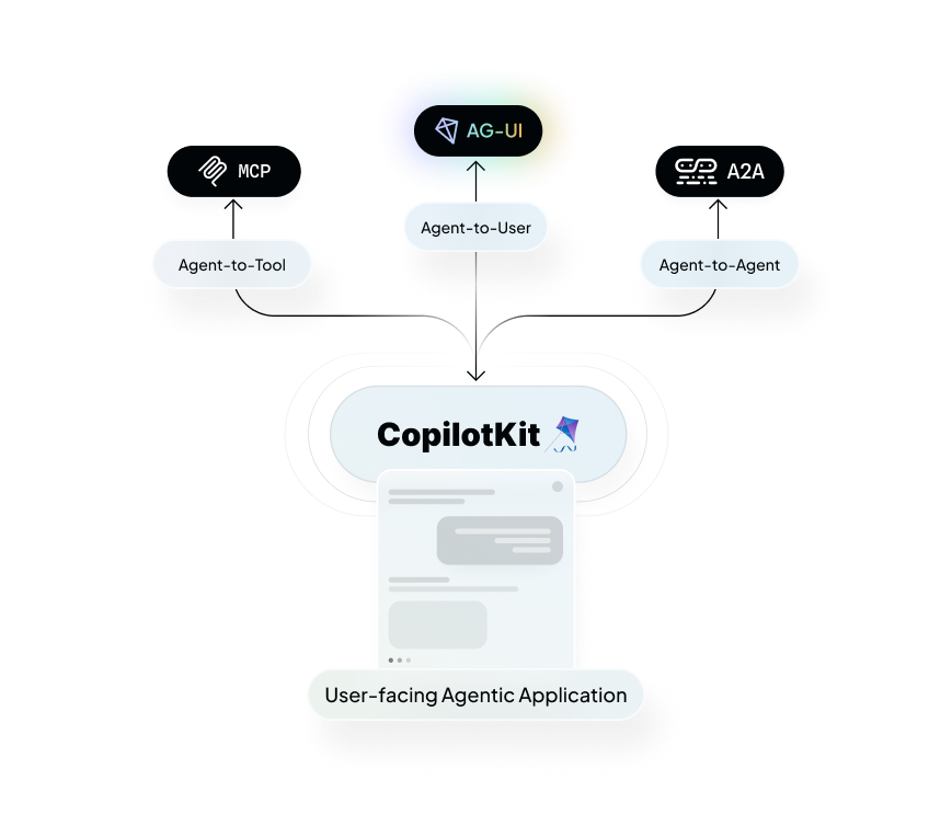
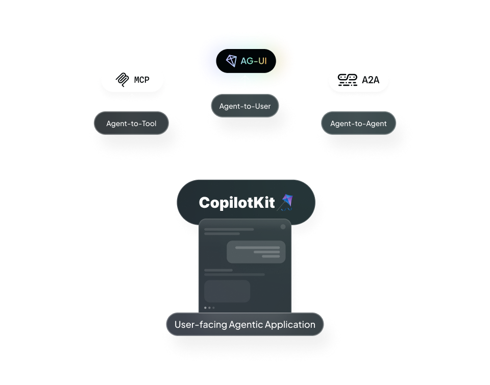
MCP is one of three prominent agentic protocols CopilotKit supports to connect agents to user-facing frontends
Quickstart with CopilotKit
Get an MCP Server
First, we need to make sure we have an MCP server to connect to. You can use any MCP SSE endpoint you have configured.
Composio provides a registry of ready-to-use MCP servers with simple authentication and setup.
To get started, go to Composio, find a server that suits your needs and copy the SSE URL before continuing here.
Connect to MCP Servers
Add the MCP server to the agent in your runtime route:
import {
  BuiltInAgent,
  CopilotRuntime,
  createCopilotRuntimeHandler,
} from "@copilotkit/runtime/v2";

const runtime = new CopilotRuntime({
  agents: {
    default: new BuiltInAgent({
      model: "openai/gpt-6-luna",
      mcpServers: [
        {
          type: "sse",
          // Try a sample MCP server at https://mcp.composio.dev/
          url: "your_mcp_sse_url",
          // Optional: send a token to the server
          // headers: { Authorization: `Bearer ${process.env.MCP_API_KEY}` },
        },
      ],
    }),
  },
});

const handler = createCopilotRuntimeHandler({
  runtime,
  basePath: "/api/copilotkit",
});

export const GET = handler;
export const POST = handler;
The agent opens a client for each server at the start of a run and closes it when the run ends.
For the HTTP transport, multiple servers, and mcpClients, see MCP servers.
Set up the CopilotKit Provider
Wrap your application with the CopilotKit provider. Set runtimeUrl to the route above:
"use client";

import { CopilotKit } from "@copilotkit/react-core/v2";

export default function App() {
  return (
    <CopilotKit runtimeUrl="/api/copilotkit">
      {/* Your app content */}
    </CopilotKit>
  );
}
Add the Chat Interface
Add the CopilotChat component to your page:
"use client";

import { CopilotChat } from "@copilotkit/react-core/v2";

export default function ChatInterface() {
  return (
    <div className="flex h-screen p-4">
      <CopilotChat
        className="flex-grow rounded-lg w-full"
      />
    </div>
  );
}
Visualize MCP Tool Calls (Optional)
Create a component to display MCP tool calls in your UI. The McpToolCall component is in Advanced Usage:
"use client";

import { useDefaultRenderTool } from "@copilotkit/react-core/v2";
import { McpToolCall } from "./McpToolCall";

export function ToolRenderer() {
  /**
   * useDefaultRenderTool registers the wildcard ("*") renderer,
   * so it paints every tool call that has no renderer of its own.
   */
  useDefaultRenderTool({
    render: ({ name, status, parameters, result }) => (
      <McpToolCall status={status} name={name} args={parameters} result={result} />
    ),
  });
  return null;
}
Complete Implementation
Combine all components together:
"use client";

import { CopilotKit, CopilotChat } from "@copilotkit/react-core/v2";
import { ToolRenderer } from "./ToolRenderer";

export default function Page() {
  return (
    <CopilotKit runtimeUrl="/api/copilotkit">
      <div className="flex h-screen p-4">
        <CopilotChat
          className="flex-grow rounded-lg w-full"
        />
        <ToolRenderer />
      </div>
    </CopilotKit>
  );
}
Give it a try
Ask the agent to use one of the server's tools. The reply uses the tool result. With ToolRenderer, a tool card also appears in the chat.
When you do (and don't) need an MCP App
"MCP server" covers three different things, and only one of them needs an MCP App. If you pick the wrong one, you build UI that you do not need, or you ship a tool that nobody can act on.
Work out which kind of server you have:
| Your server… | What the user should see | What to build |
|---|---|---|
| Reads data and returns it | Nothing, or a status line. The answer belongs in the agent's reply. | Plain MCP tool. No renderer needed. |
| Changes something (writes, sends, deletes) | What is about to happen, with a way to stop it | Plain MCP tool + a renderer, plus approval for anything irreversible |
| Has its own interface (a form, a picker, a chart to interact with) | The interface itself | An MCP App with a UI resource |
Read-only context servers
This is the most common case, and it needs the least work. Examples are a docs search, a database query, or a "look up this customer" tool. The tool result is context for the model. The user does not read it directly. The agent folds it into its answer, and that answer is the UI.
Connect the server and stop there. If you want the call to be visible rather than invisible, a wildcard renderer gives every tool call a status card without writing one renderer per tool:
import { useDefaultRenderTool } from "@copilotkit/react-core/v2";
import { McpToolCall } from "./McpToolCall";

useDefaultRenderTool({
  render: ({ name, status, parameters, result }) => (
    <McpToolCall status={status} name={name} args={parameters} result={result} />
  ),
});
Use an MCP App here only if the result is interactive, such as a chart that the user filters. A table that the user only reads does not need one.
Action and mutation servers
When a tool sends an email, files a ticket, or deletes a row, the user needs to see it, and usually needs to authorize it. Use a renderer plus human-in-the-loop for this case.
The renderer shows what happened. The approval step decides whether it happens at all, and belongs on anything the user can't undo. See Human in the loop for the approval flow, and Tool rendering for renderer options.
A useful test: if you're considering an MCP App purely to render a confirmation button, you want human-in-the-loop instead. Approval is a CopilotKit concern, not a server-supplied UI.
Interactive MCP Apps
An MCP App is the right answer when the server owns the interface. The server exposes a tool with an associated UI resource. CopilotKit fetches and renders that resource in a sandboxed iframe, with no frontend code from you.
Use one when the interaction needs real UI (a seat picker, a configuration form, an embedded editor), and when the server author should define how it looks. The cost is that the server now ships and versions UI, so a read-only lookup does not justify it.
See MCP Apps for setup.
These aren't exclusive. One server can expose plain tools and App-backed tools side by side; CopilotKit renders each call according to whether it carries a UI resource.
Advanced Usage
Implementing the McpToolCall Component
Click to see the McpToolCall component implementation
"use client";

import { useState } from "react";

interface ToolCallProps {
  status: "complete" | "inProgress" | "executing";
  name?: string;
  args?: any;
  result?: any;
}

export function McpToolCall({
  status,
  name = "",
  args,
  result,
}: ToolCallProps) {
  const [isOpen, setIsOpen] = useState(false);

  // Format content for display
  const format = (content: any): string => {
    if (!content) return "";
    const text =
      typeof content === "object"
        ? JSON.stringify(content, null, 2)
        : String(content);
    return text
      .replace(/\\n/g, "\n")
      .replace(/\\t/g, "\t")
      .replace(/\\"/g, '"')
      .replace(/\\\\/g, "\\");
  };

  return (
    <div className="bg-[#1e2738] rounded-lg overflow-hidden w-full">
      <div
        className="p-3 flex items-center cursor-pointer"
        onClick={() => setIsOpen(!isOpen)}
      >
        <span className="text-white text-sm overflow-hidden text-ellipsis">
          {name || "MCP Tool Call"}
        </span>
        <div className="ml-auto">
          <div
            className={`w-2 h-2 rounded-full ${
              status === "complete"
                ? "bg-gray-300"
                : status === "inProgress" || status === "executing"
                  ? "bg-gray-500 animate-pulse"
                  : "bg-gray-700"
            }`}
          />
        </div>
      </div>

      {isOpen && (
        <div className="px-4 pb-4 text-gray-300 font-mono text-xs">
          {args && (
            <div className="mb-4">
              <div className="text-gray-400 mb-2">Parameters:</div>
              <pre className="whitespace-pre-wrap max-h-[200px] overflow-auto">
                {format(args)}
              </pre>
            </div>
          )}

          {status === "complete" && result && (
            <div>
              <div className="text-gray-400 mb-2">Result:</div>
              <pre className="whitespace-pre-wrap max-h-[200px] overflow-auto">
                {format(result)}
              </pre>
            </div>
          )}
        </div>
      )}
    </div>
  );
}
How is this guide?